


This data is part of a series on segregation in Illinois that resulted from a six-month Governing investigation.
Methodology
Residential Segregation Calculation
Our primary measure to assess residential segregation was what’s known as the index of dissimilarity. It represents the percentage of an area's demographic group needing to move to another neighborhood to achieve complete integration for the area. In other words, it measures how evenly distributed groups are across a larger area.The dissimilarity index is one of the most widely used measures of segregation in sociology research and was recommended for this analysis from consultation with multiple researchers. Numerous other measures also appear in academic literature.
Population estimates were obtained from the U.S. Census Bureau’s latest 2013-2017 American Community Survey (ACS). We considered populations living in Census tracts, which are the Census Bureau’s equivalent of neighborhoods, with total populations typically ranging from 3,000 to 8,000.
Census tract-level data were used to calculate dissimilarity indices for entire metropolitan areas. Our calculations utilize the most recent definitions for metro areas published by the federal Office of Management and Budget in September 2018. (For some metro areas, total population estimates from the 2017 ACS will not match numbers in our report, as their area definitions have changed.) We examine segregation for metro areas, rather than for cities or counties, to account for segregation taking place over larger areas.
The standard method for calculating the dissimilarity index allows for comparing the distribution of two different demographic groups. Our report on Illinois focuses on segregation between blacks and whites, so our calculations consider non-Hispanic white and non-Hispanic black populations. There are relatively small numbers of other racial and ethnic groups in downstate Illinois areas, with the exception of Rockford’s large Hispanic population and the Champaign-Urbana area’s Asian population. (Our national segregation analysis does include results for these and other demographic groups, though.)
The formula used to calculate the index of dissimilarity for each metro area was as follows:

Along with Illinois, dissimilarity indices were calculated for all U.S. metro areas with black populations of at least 10,000. Smaller populations were excluded to account for margins of error. The national median for the metro areas included in the analysis was 0.526. (View national ranking of metro areas.)
In additional to the national rankings, Illinois metro areas were also compared to those with similar demographics. For each metro area of interest, we define a group of similar areas based on two criteria:
- Areas with total populations +/-30 percent of the metro area. (Total population correlates with dissimilarity index values.)
- Areas where the black share of the population is within 30 percentage points of that of the Illinois area studied.
Margins of Error
The Census Bureau's ACS estimates are subject to margins of error. In calculating dissimilarity indices, margins of error for individual tracts will largely offset each other as absolute values are added up for a metro area, but they can produce less reliable results for smaller populations. We, therefore, excluded metro areas with fewer than 10,000 black residents. The threshold of 10,000 black residents is nearly the highest threshold possible without excluding some Illinois metro areas.The national analysis, which includes results for multiple other races and ethnicities, also excludes metro areas with populations of a corresponding demographic group of less than 10,000.
Our minimum of 10,000 is more conservative than several other studies that have also computed dissimilarity indices for metro areas. This study published in the journal Demography, for instance, sets a threshold of 1,000 black residents.
For the Illinois metro areas we examined, calculated dissimilarity values from the 2017 five-year ACS estimates differ very little from those calculated using 2010 decennial Census data. Values for both data sets, shown below, were determined using the same methodology and geographies – the most recent 2018 metro area boundaries:
| Metro Area | 2017 ACS | 2010 Census | Difference |
|---|---|---|---|
| Bloomington, IL | 0.387 | 0.351 | 0.0358 |
| Carbondale-Marion, IL | 0.529 | 0.499 | 0.0298 |
| Champaign-Urbana, IL | 0.492 | 0.502 | -0.0102 |
| Danville, IL | 0.675 | 0.68 | -0.0045 |
| Decatur, IL | 0.528 | 0.526 | 0.002 |
| Kankakee, IL | 0.576 | 0.607 | -0.0308 |
| Peoria, IL | 0.724 | 0.693 | 0.0313 |
| Rockford, IL | 0.571 | 0.548 | 0.0234 |
| Springfield, IL | 0.571 | 0.54 | 0.0308 |
Demographers interpret differences of less than .05 to be small or not significant.
Historical Residential Segregation
Next, we assessed the extent to which black-white segregation for each area changed over time. As discussed above, our calculations rely on population data for Census tracts. Tract boundaries are generally consistent over time, but sometimes change between censuses.A few research organizations have published tract-level data that is “standardized” to report population and other measures for identical tract geographies over time. Our analysis utilizes standardized tract-level data from the Brown University Longitudinal Tract Database, commonly used in academic literature.
We compiled standardized, tract-level population data for the 1980, 1990, 2000 and 2010 decennial censuses. These datasets were then used to compute black-white dissimilarity indices for metro areas. The same definitions for metro areas, outlined in September 2018 by OMB, were used for all calculations. So, counties within a metro area today are considered when calculating dissimilarity indices from prior years of data even though they may not have been considered part of an area years ago.
Calculated indices for Illinois areas studied were as follows:
| Metro Area | 2017 5-yr ACS | 2010 | 2000 | 1990 | 1980 |
|---|---|---|---|---|---|
| Peoria, IL | 0.724 | 0.693 | 0.719 | 0.718 | 0.699 |
| Danville, IL | 0.675 | 0.68 | 0.696 | 0.7 | 0.693 |
| Kankakee, IL | 0.576 | 0.607 | 0.703 | 0.721 | 0.716 |
| Springfield, IL | 0.571 | 0.54 | 0.57 | 0.651 | 0.682 |
| Rockford, IL | 0.571 | 0.548 | 0.601 | 0.719 | 0.751 |
| Decatur, IL | 0.528 | 0.526 | 0.533 | 0.576 | 0.625 |
| Champaign-Urbana, IL | 0.492 | 0.502 | 0.475 | 0.48 | 0.486 |
| Bloomington, IL | 0.387 | 0.351 | 0.341 | 0.369 | 0.423 |
Research from Brown University offers the following guidelines in interpreting changes in values over one decade:
- Change of 0.1 and greater: "Very significant change"
- Change of 0.05-0.1: "Moderate change"
- Less than 0.05: "Small change or no real change at all"
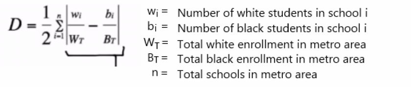
School Segregation
Additionally, we examined current levels of school segregation. For this, we compiled enrollment data for all public schools nationwide from the Department of Education's National Center for Education Statistics Common Core of Data. Enrollment data included total students, black enrollment and white enrollment for the 2015-16 school year, the latest data available at time of publication.We assessed segregation by calculating black-white dissimilarity indices for pubic schools within metro areas. (See above description of residential segregation for more about this measure.) The formula was as follows:
To define metro areas, we use the federal Office of Management and Budget’s latest guidelines issued in September 2018. Enrollment data include the county schools are located in, and we assign schools a metro area based on their county, as outlined in the OMB guidelines.
The Peoria metro area recorded the highest black-white segregation of its schools of any metro area nationally, regardless of enrollment size. More broadly, public schools across most Illinois metro areas are more segregated than other metro areas nationally. Nationally, the median black-white dissimilarity index for 242 metro areas was 0.545, when those with less than 2,000 black students or 2,000 white students are excluded. Eight of ten Illinois metro areas had a higher level of black-white school segregation than the national median. (See national school segregation results.) If all metro areas, including those with very few black students are considered, the median value drops 0.492.
Dissimilarity index values for residential segregation and school segregation are strongly correlated.
Limitations
- Because our residential segregation analysis relies on tract-level data, it will not capture segregation taking place within tracts (neighborhoods) themselves.
- Dissimilarity indices don’t account for other demographic groups not included in each calculation. Results for our Illinois-specific report strictly reflect black-white segregation.
- ACS estimates are subject to margins of error, which we attempt to minimize by excluding smaller populations.
- School enrollment data does not reflect private schools.