Select Category:
| More

Personal Income Per Capita: U.S. Counties


The map below illustrates annual changes in personal income per capita from 2010 to 2011 using data from the U.S. Bureau of Economic Analysis.

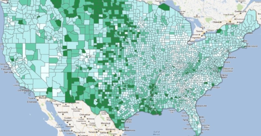
Drag to pan the map, then click a county to view data for your area. Please zoom out to view Alaska and Hawaii.

Personal income amounts shown for the given years are not adjusted for inflation (the Consumer Price Index adjustment was 26.6 percent for 2000-2010). Personal income per capita rates were computed using midyear census population estimates.

Estimates for some Virginia counties making up state combination areas were not available.

Open a full-screen version of the map

2010-2011 % Change in Personal Income/Capita
 
Less than 0
 
+0 to 2%
 
+2 to 5%
 
+5 to 10%
 
+10 to 20%
 
+20% increase

Related Content


  • GOP Governors Ask ‘What Would Reagan Do?’
  • Furious at Washington gridlock and seeking to get their party back on top, Republican governors -- like President Ronald Reagan before them -- are waging an anti-tax campaign aimed at the income tax.


Comments


Add Your Comment

You are solely responsible for the content of your comments. GOVERNING reserves the right to remove comments that are considered profane, vulgar, obscene, factually inaccurate, off-topic, or considered a personal attack.

Comments must be fewer than 2000 characters.
About

GOVERNING Data is your source for state and local government statistics and public records.


Feel free to use any data or visualizations in your own reports with attribution and a link to the source.


Contact: Mike Maciag, mmaciag@governing.com

Daily Digit

21

Number of states with pension systems that aren't "fiscally sound," according to investment research firm Morningstar, Inc.


© 2011 e.Republic, Inc. All Rights reserved.    |   Privacy Policy   |   Site Map