Public Transportation Commuting U.S. Map

Interactive map shows use of public transit for metropolitan areas throughout the country

  • Facebook
  • LinkedIn
  • Twitter
  • Email
  • linkText
Governing compiled 2011 American Community Survey data on commuting habits for more than 300 metropolitan statistical areas. Click a marker to display percentages of commuters using each mode of transportation.

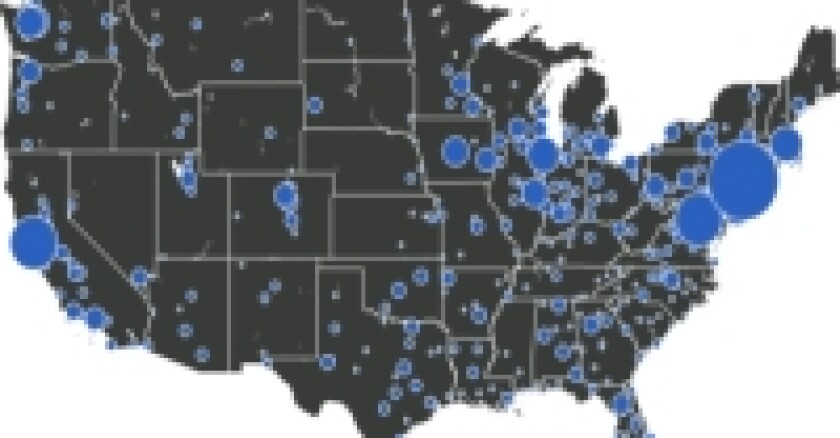
Larger icons represent areas with higher shares of commuters taking public transportation to work. The Census Bureau's survey recorded a single transportation type for a person's longest distance traveled, so workers riding bikes to subways typically count only as public transportation commuters.

Some users will need to zoom in before clicking a city. Please zoom out or pan the map to view Alaska, Hawaii and other areas of the U.S.

  • Facebook
  • LinkedIn
  • Twitter
  • Email
  • linkText
Mike Maciag is Data Editor for GOVERNING.
Special Projects